 Google was one of the main media technologies we used to get ideas for posters and magazine. We decided to use Google rather than look on news stands as they have the latest magazines covers on media technologies such as Google images. Also through the use of editing and improved technol ogies such as Canon cameras, the quality of the magazine covers has improved. On Google this would be easier to access than going into shops as that’s time wasting.
Using youtube we looked at different teaser trailers/trailers to gain a range of different concepts and the format of a teaser trailer. As many people of our age group watch horror movies we knew what would be significant for the trailer. These factors include, the killer, the props, special effects which make the teaser trailer look real. This was very useful in a sense that we were able to see common concepts used how we could challenge them and all follow the conventions which makes our trailer look similar to modern day horror genres. We used Youtube to look for inspiration because we knew that's where most film makers will post their work and every film maker has a different concept so this would be a good way for us to get ideas.
Searching for exisitng teaser trailers was hard at some points as some were fan made or was more than 60 seconds. There were popular teasers such as Scream 4, Scary Movie and A Nightmare On Elm Street. Youtube was useful becuase we could rewind the video to see what parts of the trailer we liked and if we saw any ideas hat we wanted to take note of.
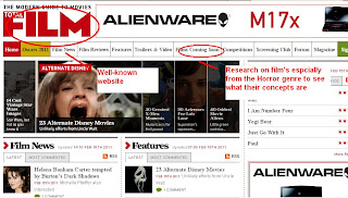
We used websites such as http://www.totalfilm.com/ and http://www.empiremagazine.com/ www.bennyemakeup.com to research different make up techniques such as bruises to make them look as real as possible. Also we wanted to look at layouts of the magazines specifically with these film sites as they are very popular with mass audiences. Looking at these websites would enable us to produce a similar magazine of that layout so it is familiar with our audiences.
The Internet was key in our research part of the course. This is because we were able to save time by using internet sites such as youtube to see clips of the horror genres and key clips of movies rather than watching full length horror films. Youtube was a great source of information that is free to use and helped gather a lot of information and research in horror movies and trailers and broaden our knowledge. While researching ideas for the magazine, poster and trailer we looked at horror websites such as http://www.bloody-disgusting.com/ which had a range of ideas for horror movies but also comments on the latest films and what people thought about them. This also helped to expand on ideas about what type of storyline we were going for.Here some of the comments on what people thought about the film. I felt this was good to look at as we could see what people are a specific target group were looking for in a horror film .
This also expanded our knowledge on Horror movies because we were able to get different ideas other the giving a similar idea of a horror movie that everybody is familiar with. Looking at popular teaser trailers such as Scream, Saw and Friday 13th we wanted to see what shots were popular with many of these horror movies such as fast cuts and a dark colour palette.This helped for a our trailer to be familiar with the audience as they would recongnise the convetions of horror teaser trailers. Examples below: We used youtube and websites to research make up tutorials on how to make fingers and to get a brief idea of a newsroom setting.
Survey Monkey was a good piece of digital technology that we were able to use for our questionnaire. This was a much easier method than using paper and giving it out to people. This saved time as we other commitments to making the teaser trailer, poster and magazine. We were able to get through to a wider audience using digital technology such as Facebook and Twitter which many of the audience are familiar with. So the feedback we got was much higher compared to if we were to give out the questionnaires on paper. The other advantage was that after the questionnaire was fully complete Survey Monkey already placed them into graphs that we could immediately put on the blog without any mistakes. Survey Monkey kept track of how many people answered the questionnaire so not to waste anymore time on collecting information that we might already have. Connecting to Twitter and Facebook to post our questionnaires was relatively easily. Survey Monkey gave choice of how I may want your questionnaire to be posted chose manually so I could post the link on different websites; mainly Facebook and Twitter which was easy access for our audience members. This would not have been possible having our questionnaires on paper as it would’ve restricted access to our target audience (16 – 24) and therefore the right information may not accumulated.
Before starting the project we each did textual analyisis of a horror poster, trailer and magazine. This allowed us to see into the horror genre and identify trends that we must apply to our trailer.
Tiffany
http://bluwhisky.blogspot.com/2010/10/textual-analysis-of-dead-snow-trailer.html
http://bluwhisky.blogspot.com/2010/10/textual-analysis-of-empire-magazine.html
http://bluwhisky.blogspot.com/2010/10/dead-snow-poster-textual-analysis.html
Cheyenne
http://bluwhisky.blogspot.com/2010/10/textual-analysis-of-saw-iv-teaser.html
http://bluwhisky.blogspot.com/2010/10/saw-iv-poster-textual-analysis.html
http://bluwhisky.blogspot.com/2010/10/cheyennes-magazine-textual-analysis.html
Morin
http://bluwhisky.blogspot.com/2010/10/textual-analysis-of-texas-chainsaw.html
http://bluwhisky.blogspot.com/2010/10/morins-textual-analysis-tron-legacy.html
http://bluwhisky.blogspot.com/2010/10/textual-analysis-poster-texas-chainsaw.html
 PLANNING Before filming I went on websites to look at exemplar ‘Treatment’ and layouts for meetings. Also, our main prop took a lot of research as there are several methods we came across. YouTube was very helpful because we could watch tutorials on how to make the fingers using latex and clay moulds. This was one method that we tried. This included using sculpting clay, Ben Nye blood, make-up and latex.

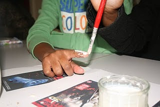 However, we attempted this particular method but we found difficulty in the numbers of finger we could actually make and how we would heat the clay up. Using clay to make the fingers was too long and would have slowed down the process of filming. Also, the clay moulds didn't take the shape of the fingers very well this may have been due to us not moulding the clay round our fingers properly. Therefore, we decided to try making a mould of our actual fingers by layering a nd heating latex onto our fingers, until it became thick enough to take the form of our fingers. We then finished it and gave it a realistic look by adding foundation to the skin, stuffing the inside of the mould and then using stage flood to give it a severed finger effect. http://bluwhisky.blogspot.com/2010/10/props-preparation.html
we also had a proffesional special effects maker to come in and show us how to make up, this was very usefull.
http://bluwhisky.blogspot.com/2010/11/professional-latex-making.html
Location During the planning process we was evaluating the best place for use to shot or teaser trailer. Because our trailer is a teaser trailer we wanted to give as little away as possible.
Trailer We shot our trailer in several locations inside our college. We tried to film in places where the audience would not realise it is a college. Our close up shots of the mouth and fingers was shot in front of a red door. This showed continuity because red s a colour that appears constantly throughout the trailer. Our shots of our weapons, football and fingers in the sink. The location we shot theses scenes in was in the janitor’s cupboard, it gave a haunted, dirty feel to the shoot. If we had shot on a table it would looked too cleans and not fit into the horror genre. The janitor’s cupboard is really creepy and something that is used in many horror films. We didn’t shoot in the classroom because we felt it was too clean. Also the classroom had the large blue screen at the back of the room, this made shooting limited, that’s why we choose to only have one shot in the classroom.
Poster For our poster again we didn’t want to give away too much. We choose to take the picture in front of a glass door in college. Again we used a red door to keep the colour red consistently throughout our media products. The best thing about this glass is that it had thin strips of wire going horizontally and vertically through the glass. This gave a sense of imprisonment, also our main killer being behind the ‘trapped’ glass made you feel like she’s luring you into a trap.
Magazine For our magazine we shot the photographs in numerous places but decided the picture in the classroom was the best. This is because we were given the use of a soft box which allowed use to produce professional looking pictures. The blue screen was not a problem for the photograph because we darken the area around our actress, this made the photograph look like it was shot on a black screen. Different locations we tried included, classroom, corridor, floor and outside.
Time management
Due to many complications with filming some scenes again the main actress was not available to shoot all scenes accept for the ones where the audience sees her face. Also, the time of day that we were filming was not compactable with her timetable. When filming the close of the killer's lips we used a member of our group so we wouldn't have to wait another week before we could use our main actress.
Although we used latex to make the fingers it still took a lot of time to add detail to them so it could look realistic. So we each took some fingers home to add foundation of different shades and then brought them back to college so the Ben Nye make up could be added. We choose different colour foundations to create a range of skins tone as we want to appeal to young target audience but of different races. Ranging the skin colour was achievable by mixing different foundations together.
As our trailer featured a lot of props rather than ‘action’ we decided to bring our own props in as there wasn’t much choice of available in the college studio. This included the pitch fork and knife, football and the making of the fingers.This also helped as it didn't delay the filming process.
Poster/Magazine
When doing our poster and magazine pictures we decided to take them both at the same time. At glance some audience may thin that the poster and magazine cover follow a similar look however, we wanted the audience to recognise a main character. We saved time by taking the pictures at the same time and we different lose any quality in the pictures or straining for more ideas and we had them planned before hand.
PRODUCTION During filming we saved a lot of time setting up footage because we became very familiar with how to set up the equipment such as lights and camera correctly so the majority of the time it was set up in about 5 – 10 minutes. We always had two people setting up footage just in case something is dropped. During filming we always had two people on set. One was filming or taking pictures and the other was directing, the pictures below are examples this. Any problems we had we asked the teacher or assistant to help us solve.
http://bluwhisky.blogspot.com/2010/11/how-we-filmed.html
http://bluwhisky.blogspot.com/2010/12/equipment-used-during-process.html

 Whilst filming our footage for out trailer we used the technique of counting in and out. We found this useful because it clearly shows you were the footage starts and finishes.
 When filming we learnt that lighting is the key element. Having the set well lite is important to make sure everything is shown clearing and well shot. In good lighting it is also very clear and see if what your filming is in focus. When filming it is also important to make sure that the set is evenly lite. Its iimportant to make sure the set is evenly lite toavoid shadows on photographs or film. The image below shows the ideal lighting to prevent shadows.
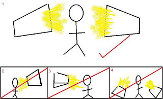
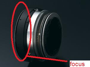
Focusing When using the camera we did have troubles focusing when we first started filming. When your so focused on just filming and getting the shots you forgot about focusing the camera. When we learnt the importance of focusing the camera when we had to re film parts of the footage. One effective way to focus when filming was to press the button circled in red.
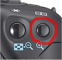 This allowed you to zoom in to specific parts of the footage and focus the lens at the centre which lead to a clearer shot over all. This method is manual focusing.
Health and safety was very important during filming because we were using very heavy equipment and specialist make up equipment. When setting up the lights, as a group we assembled the lights on to the tripod and made sure they were firmly in place, we often ask nearby teachers or support staff to double check if it was securely in place. We also did this when assembling cameras onto the tripod. We filming or taking photographs we made sure each set was clear of wires because many people would be pacing by. When using specialist makeup products we tested it on a part of the models skin and waited for 10 minutes to make sure there was no allergic reaction before continuing. We did this for products such a latex and fake blood.
POST-PRODUCTION Editing When researching horror trailers, we noticed that many on them were heavily editing fast, sharp cuts and special effects. This effect helps to create a fear effect to those who are watching it. We always noticed that many teaser trailers are short and snappy, giving the audience a glimce of the potential movie. All these factors help create the perfect teaser trailer. We watched several trailers on youtube to see our the effects were done. To edit shots of our teaser trailer we used Final Cut Pro. For our poster and magazine cover we used Photoshop.
 The two screens allowed us to make edits and changes on one and then view the footage on the other screen.
 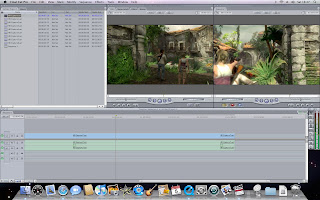 There were filters that we also used to alter the lighting of some shots and add tints to the shots of our victim. As seen in the image below there is a greenish tint on the shot and this was to give it a 'filmy' effect and we thought was more effective than the clear, plain previous shot that was recorded.
  To get the font for our text we used www.defont.com, this allowed us to view a database of different and free to download texts. Our text we downloaded was corpse.
Sound As a group we discussed the key sound we wanted our trailer to have and what impact we want it to have on the audience. We wanted our soundtrack to be very tension so the audience felt drawn to the trailer. As a group we thought racing heartbeat mixed with classical instruments could create this effect. We then contacted a friend in college who worked in the music department to help us put this piece together. He used the software 'Logic' to create the background music. A key element of producing the sound is that it was in sync with the trailer and during process, we had to have the trailer running to make sure the music was in sync. We wanted the trailer to start of calm then build up with high tension to match the quick cutting of the shots and finale scream, therefore the sound ending with an anti-climax. Learning how to make a bacground score was a real geeking out stage of production, because we learnt and explored concepts we are not normally used to.
Memory card
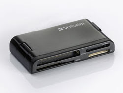 During filming many of our pictures and footage was saved oto a memory card. This memory card was then put into a Verbatim memory card reader which was then plugged in the mac which then allowed us to transfer footage and pictures from the card to the mac so we could continue editing and processing.
 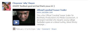 Facebook - we posted the youtube link on Facebook and because many of the people are the age group we are targeting and who were likely to have filled out the questionnaire. They would be able to comment on what they thought was effective and whether this was what they were looking for in a horror teaser trailer. Posting the videos on people’s profile would effectively attract more people to watch the trailer. By this the trailer is gaining more publicity. This helps to create a ‘buzz’ around the film. Facebook was key to gaining feedback and views from our audience. The internet is a key in any aspect of media because it creates a global network for easy communication.
The film was posted manually on sites such as Twitter and Facebook which are popular with our main target audience. We felt that using popular sites such as these we would be able to reach out to our audience better.
Twitter – On the twitter account the status was updated regularly by posting the youtube link to our teaser trailer or you could personally ‘@’ the person and get personal feedback. We saw this as an effective way of marketing the film as twitter is a social network used by our target group and you can ‘@’ anyone to look at the teaser trailer.
There are also different ways to market our film http://bluwhisky.blogspot.com/2010/11/marketing-our-film.html




Feedback-
ReplyDeleteOK ladies, there are a number of areas where I can see some potential for improvement.
1. please add the question as well as the number.
2. please get rid of the empty white space between images- check the edit posts option- there are some boxes that should allow you to format more easily.
3. the research section- all good, except, I would like to see a little more depth on your use of Survey monkey- especially pointing out the specifc advantages of using this to other paper-based methods.
4. the planning section is too short- especially the section about making your fingers- I would like to see you incorporate a slide show here, showing your experiments, and the stages of making a fake finger. it could be hosted somewhere else, and embedded into the blog post.
5. move the practicing with the equipment section out of production, and into the planning section to even things up a bit.
6- in the production section- I would also like to see you add more information about correct operation of the camera- including setting white balance and exposure, and ensure you can add some images of this.
Try to get all of this work completed by the 25th march, and see me if you have any queries.