EVALUATION QUESTION 2
How effective is the combination of your main product and ancillary texts?
MAIN- TEASER TRAILER
ANCILLARY- POSTER AND MAGAZINE
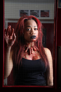
Our leading actress who plays the ‘Cannibal’ has a very iconic image
Her image is very similar across the board in our teaser trailer, poster and magazine cover. Her hair is a fiery, intense red which connotes her mad and crazy persona. It also draws on the connotations of blood and danger which again mirror her character.
Her make up is outrageous with the black lipstick and her main accessory, the finger necklace. Her excessive look connotes a theme of insanity and this can be found in a lot of real horror movies.
Looking at the magazine cover, poster and the teaser trailer, we can see that the image of the 'Cannibal' is quite consistent.
The Silence of the Lambs: Dr Hannibal Lecter
Although 'Bufalo Bill' is the main killer in the film, Lecter is a primary antagonist and he portrays a terrifying cannibalistic character who always looks deranged. *****
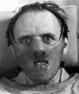
The wide eyed, 'creepy' stare that both Hannibal Lecter
and our 'Cannibal' have convey insanity and terror that would cause our audience to feel unsettled and uncomfortable.
Halloween: Michael Myers Michael Myers is a character that is considered by many to be the "embodiment of pure evil" as he the audience never hear him speak and is always emotionless. This is shown in the image below where he appears impassive and cold-blooded whilst strangling the female character.
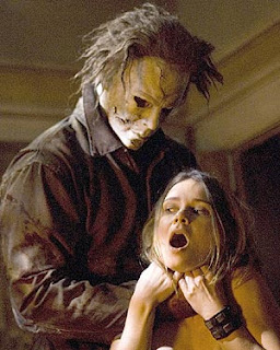 This sort of complete, unhuman insanity is what we tried to capture with our female 'Cannibal' because there is so much mystery behind her motives for not only killing, but eating young college boys. Her lunacy runs through the trailer, poster and magazine. The last shot of her screaming, the intense, stony-eyed look in the poster and the manic, wide-eyed look in the magazine all corroborate together to show her delirium.
 Fingers For our media trailer we wanted to create something that the audience would remember our trailer by, we wanted to create something that would become iconic to ‘Cannibal’. This is where we created the fingers. Due to our leading actress being a women it is stereotyped that women always we necklaces. It was then our challenge to that this concept and adapt it to our horror theme. Since our actress was a cannibal we thought it would we right for to have the fingers of her victims around it neck, this would be like reminder of all the people she has killed
.  We used the fingers in our magazine, poster and trailer to create a sense of continuity. The costume of the actress was kept the same so identification could be made throughout the main product and the ancillary texts. This and the fingers would help the audience to link our teaser trailer, poster and magazine together. Linking the three products together with the same costume and fingers n each helped to create a buzz about the movie. It would make the audience want to know how she got the fingers and why.In the above photographs you can see that we used the fingers throughout the filming and photographic scenes and even in the shots that were not used.We wanted the fingers to be iconic to the film. we wanted to create and effect that you can recognise without even seeing the killer. We have seen this done before in films such as Jason's hockey mask in Friday 13th and the infamous Scream mask.

In the pictures above you can see a series of pictures of the scream from the movie and posters. The picture with (*) on it was were the horror movie scream originated from. The painting was created between 1893 – 1910 by the Norwegian artist Edward Munch. The writers and producers of scream have created the iconic effect of the scream mask that can be recognised aware. On Halloween people often dress up as scream with the mask on, this has helped the scream mask and black cape become recognisable worldwide. Colour Theme
When thinking about our horror trailer, poster and magazine we also had to decide on the appropriate colour scheme. We thought differently about the colours and the connotations of each. We choose the colour red because it is most commonly used in the horror genre and more specifically the slasher sub genre that we were trying to adapt to. Red connotes blood and danger which are a primary aspect of our teaser trailer and also we imply danger with the tagline of our poster.

The continuity of the dark theme throughout out poster, teaser trailer and poster enables the audience to identity our products easily. The visual style of all three products vary in terms of how the charcter is being viewed. So for example on our magazine our female killier is in character which is her being 'crazy'. On the poster she's more calm, this creates suspense because the audience will never know when she is about to attack to her victims. What helps the audience to identify the products is the dark colour theme, the fingers and images used. When promoting, our fingers will be our main focal point because we believe it can become an iconic image for our 'Cannibal.'
The fonts used in all three products are mainly Serif because it's sharp and can be used in many horror trailers depending on the story which catches the eye easily.Serif font used in the trailer which is Red.
The serif font in the trailer and the magazine are both very similar. The first font which is on the trailer looks like it has blood dripping off it shows that the film is going to be 'bloody'. The font below which is on the magazine connotes the use of sharp obejcts. They complement each other as they both relate to the theme of horror and items associated with the blood and killing people. By using two similar but different fonts it reveals a little bit more about the film.
The Ring
The sans serif font is the same as what is seen on each of the posters. The difference in the Cannibal teaser trailer is the title is different from the other texts although they are both serif. In the Ring trailer this helps the branding of the film. This enables their audiences to identify with the film which what we have also achieved in branding our three products.
Due the rise in many young people ages 16- 24 years old using the internet it would be useful for our trailer to be viewed on social networking sites which is very popular with many people of that age.
We also wanted to see how it look viewing our trailer, poster and magazine on-line. This would be in case the font size may be too small or too big or the picture may look pixealted so cannot be viewed properly.
Using cross media promotions makes it accessible for all audiences. For example The Dark Knight used cross media promotion. For example they used a dominio pizza box below:
This item also gives the cult appeal to the product.Using this type of Cross media promotion we will be able to extend to further audiences. This also makes the audience feel as though they are part of the whole experience. As the fingers are original it ccan create a cult appeal. The advantage of this is that the film is therefore memorable to the audience.
Access via smartphones such as blackberry and the iPhone is essential amongst our target audience.

Although the we are able to view the poster on a smartphone the bigger fonts are more noticable than the small font. However, the picture is still central which what we want our audience to look at. Traditional means of advertising such as billboards, magazines etc... As well as the target audience using billboards and other traditional means of advertising we are also bringing in a mass audience.

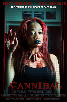
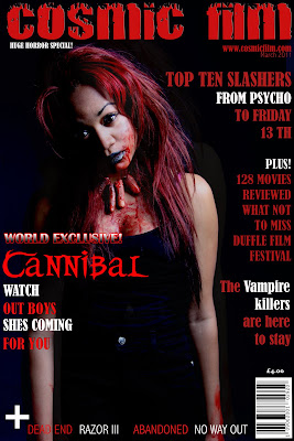

 The quality of the magazine cover and poster compared to mainstream media outlets varies in terms of fonts, colours, the quality of the image and the organisation of the text. In the trailer the quality of the shots conveyed the message quite well. The image quality is appropiate for the horror theme as it shows her in character with a look of imsanity. Compared to the Empire magazine below it shows they are both in character which is likely to attract an audience therefore it fits in with other mainstream magazines. However, more effects could have been used on the image itself. Adding more to the background to embrace the horror theme more so the audinece know the magazine is part of the promotional products for the film. The poster
 With the use of CGI in film today special effects have advanced immensely with the new technologies. For example Friday the 13th in the old film this was used with the man inserting his head in the pillow and neck made. Now that may look obvious but CGI has been used in modern day horror movies to give realism. This is able to make the film more realistic to the audience. To have something more believable the audience is likely to be more scared by it. However, not all audiences see CGI effects effective enough as it doesn’t make the film look real therefore in the case of a horror movie not scary. Here is some footage of Kevin Bacon being stabbed in the neck:
Graeme Burton theory The Burton genre theory has been applied to film. Burton says that we look at key features to help us recognise a genre of a film. There are specific features he states which are; the protagonist, stock characters, plots and stocks situations, background and décor and themes. In a horror films the protagonists is likely to have some sort of super strength, a weapon and possibly a mask. Also people who are the main victims are also protagonists.
We had two protagonists in our horror teaser trailer, one being the killer and the other being the main victim. Our killer followed through all our media products, so she featured in the magazine, poster and trailer. We gave our killer bright red hair and finger necklace so she really stands out and sticks in the audience’s head. The main purpose of out other protagonist the victim was to show the audience what our killer is cable of. The main weapon was the knife and garden folk to show our killer is distrubed
The stock characters include some victims who differ from the main victim and other people who may get in killed in process of trying to catch the main victim. In our trailer we have not used any stock characters. We have done this because our trailer is only a teaser trailer to entice the audience and not give too much away.
The plot and stock situations may be the gruesome and bizarre deaths and some situations that revolve around the plot. The décor and theme are normally quite ordinary and safe but by night time the mood has changed. The houses in which the killing may take place are nice, middle class houses. The effectiveness of these authentic features shows that these killings may happen in an area we live in.The décor we choose for our teaser trailer was very dirty and bloody, this was making it clear to the audience that it was a horror movie and a slasher horror movie. We wanted the colour red to follow through our trailer as it connotes death or danger.


 The wide eyed, 'creepy' stare that both Hannibal Lecter
 We used the fingers in our magazine, poster and trailer to create a sense of continuity. The costume of the actress was kept the same so identification could be made throughout the main product and the ancillary texts. This and the fingers would help the audience to link our teaser trailer, poster and magazine together. Linking the three products together with the same costume and fingers n each helped to create a buzz about the movie. It would make the audience want to know how she got the fingers and why.In the above photographs you can see that we used the fingers throughout the filming and photographic scenes and even in the shots that were not used.We wanted the fingers to be iconic to the film. we wanted to create and effect that you can recognise without even seeing the killer. We have seen this done before in films such as Jason's hockey mask in Friday 13th and the infamous Scream mask.
 Although the we are able to view the poster on a smartphone the bigger fonts are more noticable than the small font. However, the picture is still central which what we want our audience to look at. Traditional means of advertising such as billboards, magazines etc... As well as the target audience using billboards and other traditional means of advertising we are also bringing in a mass audience.


Feedback- this blog post is good, but its' structure needs some consideration- the very interesting information about Burton needs to be linked carefully into the question, otherwise the examiner will not understand its' relevance.
ReplyDelete