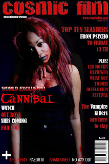
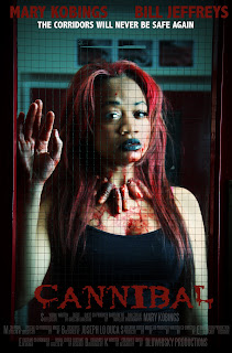
Some scenes of the trailer strictly followed conventions of Horror. We used blood, severed fingers and an insane female protagonist. The audience who may have expected the main victim to be female which is conventional for many horror genres in fact was a male which added to the excitement and intensity of the teaser trailer.

Overall the feedback on the magaizine was more critical than the poster. Most people said that colours on the magazine was too much and the 'Cosmic Film' should have been a different colour. However, they agreed that the image was striking and immediately caught their attention. Also the magazine cover was too dark and needed White to balance out the darkness but some disagreed and saw the White as reducing the appeal of the magainze to an extent. This shows that we need to improve on how we deicded on colour scheme and not using too much red which makes the magazine look too bloody.

 The colour scheme was the overall comment about the poster and the fingers were really piercing and stood out for most of the audience which shows that the fingers being an iconic item throughout the main and ancillary products has been a success.
 The overall comments about the trailer were good. Some people said that they liked it short and kept the audience wanting more, although for some the teaser trailer was too short and a few more seconds could have been added on to it. The trailer was also posted on twitter to get more feedback form a wider audience. Here is some of what was said:

Statistics: This shows where people have viewed and how many people haved viewed our trailer. From this we can also see that 121 views from from the facebook embedded link. On a mobile device which is likely to be a smart phone there were 48 views this shows that it's siginificant for the trailer to have good video quality so it can be viewed on a mobile device. The teaser trailer was also viewed through a related video which enables the video to be viewed by a number of audiences. Through this the best methods for promoting the trailer were facebook which is social networking site which is extremely popular with our target audience. As Facebook has the most the most views and is popular with our target group then this is the nest method of promoting our trailer.
Below is shows the countries the trailer was most viewed. England and Nigeria being the highest and America and Canada with a significant amount of views. This suggest the amount of interest the teaser trailer has gained through media technologies such as YouTube.

This video contains people's feedback and initial thoughts on the teaser trailer:
- Overall, the audience were very taken by the effectiveness of the fingers and with the fingers being featured in all the media products which made the trailer recogniseable and the main character.
- The consistent use of Red brought the quality of the magazine down.
- The trailer could have been longer to give more of the storyline and create more suspense.


Feedback:
ReplyDeletesome good content in this blog post, but a few corrections are needed:
1. add the question as well as the number.
2. rephrase the first paragraph so that it reads better- there are a couple of grammatical errors there.
3. please create a summary of your main feedback findings- perhaps in the form of bullet points concluding what your audience thought of the package overall.