Sunday, 12 December 2010

meeting 9

Organisation: BluWhisky

Members: Morin Keshiro, Tiffany White, Cheyenne Dwyer

Date/Time: 05/01/11 - 1:45pm

Notes on the agenda

*Skills development- In preparation for our evaluation, as a group we discussed the skills we have developed from the start of our project. We decided that we will blog about the four different aspects of producing the teaser trailer which include: Research, Planning, Production and Post-Production. Seeing as we have all developed skills in all the areas, we will all have an input into each section.

*Filming and Editing- At this point we have successfully finished filming our trailer including shots that we had problems with before the Christmas break. Editing will now continue progressively.

*Sound- We have now begun to put down ideas for what kind of background music we want our trailer to have. Recording voiceover of newscaster should take place at the latest by next week.


Equipment used during the process

- Canon EOS 7D (Video Camera)
- Canon EOS 400D (Photographs)
- Track
- Kino Flo lights/ dimmer
- Vinten Tripod
- Soft Box - To take the shots for the poster and magazine cover in the studio and other locations. The lighting was dimmed for a darker effect on the magazine shots.

Monday, 6 December 2010

Unmanipulated Pictures


These are some of the unmanipulated photographs taken for our Magazine Cover and Poster. They vary in location and lighting i.e High key and low key.


Saturday, 4 December 2010

Meeting 8

Organisation: BluWhisky

Members Present: Cheyenne Dwyer, Morin Keshiro and Tiffany White

Date/Time: 03/12/10 - 2.15pm

Review of progress - We encountered problems with our trailer which included some shots that were 'out of focus'. We as a group concluded that the errors were irreversible through editing and that re-filming and possible, slight change of storyboard was inevitable. Although this course of action would set us back to some extent, we feel it is the best decision to get the best possible trailer. Re-filming will take place as from next week and after the Christmas break.


Editing - The editing of our teaser trailer has been slowed down a bit so we can focus on the magazine and poster.


Magazine and Poster - We have decided to take the photographs again, so we can use the lighting more effectively and make use of our surroundings to give us a more realistic effect.

Thursday, 2 December 2010

Shooting Script

Our shooting script has 5 main scenes. In a normal trailer it will have more than this however since we are creating a horror trailer we wanted to minimise the amount we tell the audience.

Scene 1 Close up of mouth

Location – in media corridor in front of red door
Dialogue – none
Sound - cannibal soundtrack

Shot description
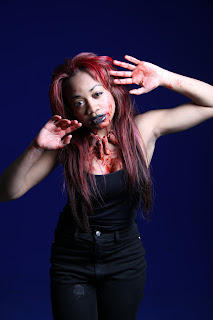
These shot are a series of three shots spread out through the trailer. We created these shots to tease the audience by not revealing full shots of the killer. We only revealed a close up of her mouth with blood covered and her beating chest also cover in blood. We wanted to film in front of the red door because it displayed continuity since red s our main colour used in out media products.

Scene 2 Victim

Location – in a cleaning cupboard
Dialogue – none
Sound – cannibal sound track

Shot description
These were a series of 3 fast shots of the victim. We made sure the audience saw the victim and the cuts and bruises to the face. This was helped link the trailer to the horror genre. The close up of the victim allow the audience to see an attack had been made.


Scene 3 Sink

Location – sink
Dialogue - none
Sound – cannibal soundtrack

Shot description
Weapons. In these shots we reveal the weapons cannibal uses. We also reveal the football that is key because it shows that the victim is stereotypical male. And finally the finger that helps connote HORROR. We have also used a sink covered in blood to link our trailer to specifically slasher, horror sub – genre.

Scene 4 Screaming

Location – media classroom blue screen
Dialogue - screams
Sound – cannibal soundtrack

Shot description
A brief finale shot of the killer screaming. This shows the craziness of her character.


Scene 5/ captions
All the captions used in our trailer were all red and the same font to portray continuity. The font we used for ‘Cannibal’ was the same as the font used on the poster again linking the media products together.


Filming script

1) White noise fussing in. cuts to 2
2) Moves to close up of the chest. This synchronizes with the sound of the heartbeat starting. Cuts to 3
3) Writing fades in ‘when everybody’s gone. Fades to black then 4
4) Writing fades in ‘she traps her victims. Fades to black then 5
5) Quick flash of weapons. Fast fades to 6
6) Quick flash of football. Fast fade to 7
7) Quick flash of fingers. Fades to black then 8
8) Extreme close up of the killer mouth covered in blood. It features the iconic fingers. Fast cut 9
9) Writing getting smaller ‘one’. Cuts to 10
10) Flash of victim. Cuts to 11
11) Writing getting smaller ‘by’ cuts to 12
12) Scene of victim clearly injured in shock. Cuts to 13
13) Writing getting small ‘one’. Cuts to 14
14) Close up of victim. Allows audience to see damage done to victim. Cuts 15
15) Cuts to extreme close up of killer with blood dripping and fingers.
16) Killer screaming.
17) Title ‘cannibal’
18) ‘Coming soon’ and credits.

Thursday, 25 November 2010

Marketing our film

Big brand places such as KFC, McDonalds and Burger King are very popular with our audience preferably young people aged 16-24. Using big name brands to advertise our product with our horror theme will keep the audience enticed. For example having a red and black McDonalds packaging which reinforces the horror theme. The use of our slogan and a picture of the fingers. With this form of advertising we are reminding the audience of the film and creating a buzz and encourage more audience members.


Tuesday, 23 November 2010

feedback:

Girls your blog is developing very nicely. Well done.  You have taken a dedicated approach to your coursework, well done!

Meeting 7

Organisation: BluWhsiky


Members present: Cheyenne Dwyer, Morin Keshiro and Tiffany White

Date/Time: 19th Nov 2010 - 14.00


Notes on the agenda:


*Review of progress- We as a group did a quick review of the progress we have made in regards to filming. We have filmed all the necessary shots that needed to be re-filmed with success before the deadline and an improvement has been made on the quality of filming.


*Editing- In order to keep on top of work, a lot of our spare time has to be put into the editing of our teaser trailer. We have started to put the shots together in order of the storyboard and time now has to be invested in making the cuts and doing more research on sound.


*Magazine cover and Poster - The photos taken of our actress that will be used for our magazine cover and poster should start being edited and photoshopped in the coming week.

Professional Latex making

Latex is a liquid forming product used by many make-up artists in the film industry to give the effect of realism in creating cuts, scabs, and deep wounds. For the product to be used effectively, research has to be done on the skin as well as the human body so to know how these cuts and scabs may form especially when trying to create realism for film.

Things that will be needed:


  • Soldering tools

  • Spray paint

  • plastic cup

  • J-wax equivalent would be Mr.Sheen

  • Tile or something with a flat surface

  • Latex

  • Powder


The clay is first spread out on to the flat surface and using the soldering tool, cut carefully round the edges and spray paint the mould with Mr.sheen or J-wax (both do the same thing). Also we have make sure that the cup fits the mould and using a glue gun go round the edges. This is to make First, place a Plastic cup on a flat surface and with a pen draw round the edges and of the clay mould.


In the cup we added white powder until it rose above the water, this was then to be poured on to the clay mould. When moulding no air bubbles should be gained.


The latex then dries up to form a caked mould.


We then cover the top layer of the latex mould with fresh latex and use a cotton bud to spread it across, especially the 'injury' indentations.


This is what the latex wound will look like when dried up.


Sunday, 14 November 2010

How We Filmed


During filming we had to keep changing the lighting and the focus each time the shot changed. This allowed us to have the appropiated setting for each scene.


These photographs we were filming wwere for our orignal idea for the trailer which protrayed a normal looking women with fingers and blood around her neck, with a bowl of blood and the weapons she used to kill her victims.


In the first stages of we let all members have a go at filming and taking pictures to establish who could produce better picturs therefore be in charge of filming and the camera.


Before setting up the filming equipment, we applied make-up to our models. This was so not to leave the equipment left unguarded. We putting the lighting into place, this was adjusted many times to see how it looked on film. First we filmed the news reporter in the studio,with this we shot four times. We had many difficulties filming this scene and decided to film it again.

Inspiration for poster

1) Jennifers Body


For our trailer, magazine and poster, we adapted some features of Jennifer’s body for work. We wanted a strong sexy female who preys on me. We wanted a female to prey on men to go against the typical conventions of a horror film. Many horror films such as Halloween and Friday 13, have a single male killer who will kill a wide range of people but one women would survive. We wanted to break this convention in order to appeal to a wider market due to horror films usually being targeted to young males. We used Jennifer’s body as a template because that is the most recent film who managed to reach out to more than the typical audience. in the two posters above of Jennifer’s Body you see Meagan Foxx posing as a attractive school girl. We wanted to make sure that our lead female could portray the same strong persona that Meagan Foxx has.
2) True Blood and Jennifers body
You can see in the above pictures that they have used a slight dip of blood to show there is some sort of killing occurs in the show. We wanted to go for a more full on blood approach to show torture and feast of flesh of our leading lady and to fit into the slasher genre.

Poster and Magazine Drafts


Props Final

Our Props


For our horror trailer we had different props to help our audience identify our film and characteristics of our film.


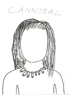
Our main prop was our fingers. We wanted to create something new and iconic that the audience could identify our film by so we created the FINGERS. Our fingers we made with latex. We layered latex on to our fingers to get the print. We had to do several layers to make sure the latex was thick enough. We then painted them in foundation and blood then stuffed then with tissue and clay.


The other props we used in our teaser trailer was a football, football boots to signify her target victims.


football to identify her victims for college football players.


weapons used to killer her victimes and the blood mess after.